The Pepsi Challenge and Design
Introduction
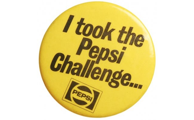
The Pepsi Challenge was a marketing campaign where customers participated in a blind taste test of Coke and Pepsi. Many people people prefer Pepsi in this situation.
It’s quite misleading though. Pepsi is sweeter than Coke, so a small cup of Pepsi might seem better, but a full cup might be too much. The same consumer might prefer a small cup of Pepsi, but a large cup of Coke. This observation appeared in Malcolm Gladwell’s book Blink: The Power of Thinking Without Thinking.
There’s a general lesson here for design.
Impactful design
When designing a website, it’s tempting to add elements which make it standout. To use the Pepsi/Coke analogy - to make it sweeter. When people first visit the website, they will be taken aback by the nice design elements, and it will create impact. The website is like Pepsi.
However, if you look at most of the popular websites on the internet … they’re kind of dull. Facebook, Google, and Youtube are all very stripped back designs. Nothing jumps out when you visit those websites. They’re low impact. These websites are like Coke. The same elements that make a website impactful can be tiring to look at if you use the website frequently.
I believe that over time, as people use a website more, what they want is something calm and simple.
How this effects designers
I’m sure most designers have experienced this for themselves when designing a website (or other product).
They’ll create mockups, which start off quite simple. Then they add some extra elements to create high impact (for a website, it might be some graphics, a background pattern, some strong colour etc). When they ask for feedback, people are impressed - and enjoy the high impact elements. But most feedback is given after looking at a product for a few seconds. If the same person looked at the design for a few hours, they might change their mind.
The designer usually comes to this conclusion themselves - after all, they do end up looking at the mockups for hours whilst designing them. A lot of the high impact elements end up being removed.
Is there room for high impact?
Sometimes a design needs to be high impact. For example, a splash page for a new website, or a poster. Customers won’t be looking at them for long periods of time - so high impact elements can help grab attention.
In this case, where high impact is required, it’s important that the designer doesn’t tone it down too much over time. One way to avoid this is simply to put the design away. Don’t look at it for long periods - that isn’t its purpose. When you bring it out again, does it still create the same impact?
Conclusions
It’s important to know if you’re designing for high impact, or long term use. They require different approaches to user testing, and discipline from the designer to resist the urge to tone down a high impact design, or oversaturate a product designed to be used all the time.